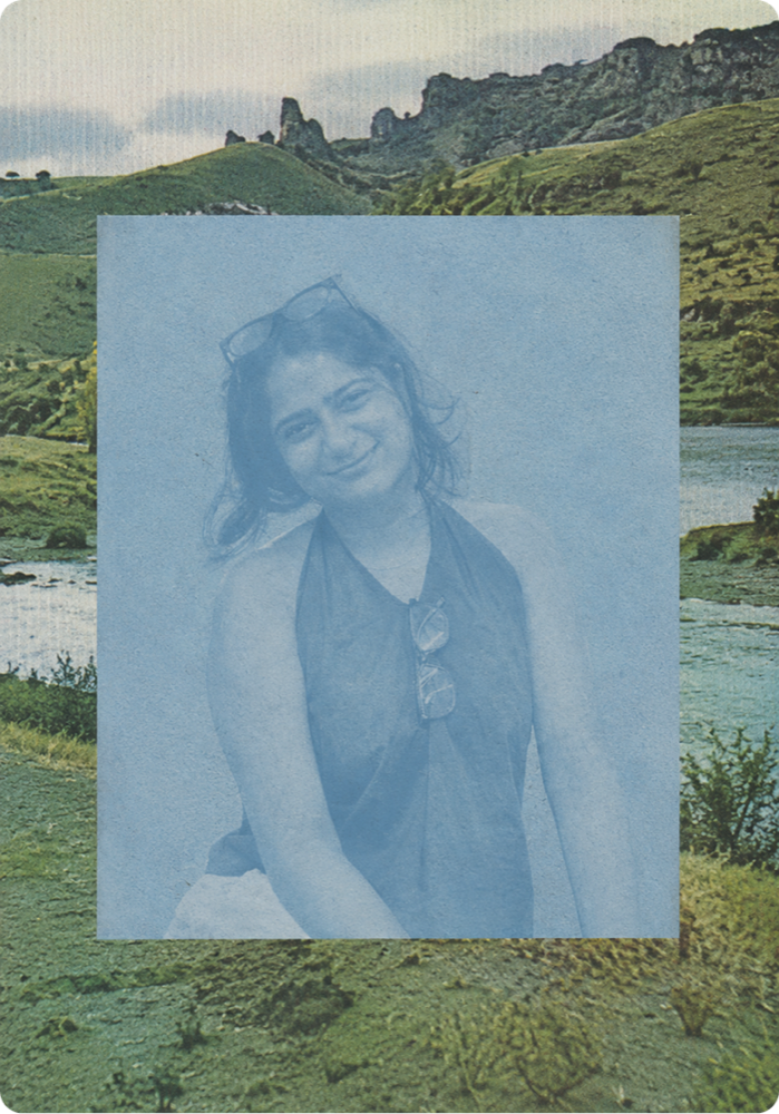
I am a Digital Product Designer from Himachal, India, designing thoughtful digital products that bring clarity to complex systems and experiences across enterprise and AI.
Anoushka has shown exceptional growth and leadership, bringing structure to UX Testing, strengthening design-dev collaboration, and enabling the team through thoughtful documentation, onboarding, and support.Krista Taylor · Director, Product Design @TIAA
Anoushka is a creative and dependable product designer with sharp thinking, a keen eye for detail, and a strong growth mindset. Her energy, curiosity, and ability to simplify complex problems make her a joy to collaborate with.Mallika Lahiry · Product Designer @StudioCarbon
She consistently demonstrates ownership, integrity, and diligence. Her calm approach, strong work ethic, and willingness to step up under pressure make her an exceptional collaborator and a trusted team player.Prabhu Mathiah · Leadership @Accenture Song


I'm a product & interaction designer focused on early product thinking in complex, data-rich enterprise and financial systems. I design AI-integrated and agentic product experiences, crafting secure, accessible, scalable interfaces while keeping human judgment in the loop where it matters.
Fluent in design articulation and systematic in execution, and always collecting odd little design-psychology facts about why people behave the way they do.
Resume



What happens after the Figma file handoff?
Across three releases, 98% of UX defects were caught and resolved before they ever reached production.
Most design work has a clean ending. You align, you hand off, you move on. I thought that was the job.

On TIAA, I sat on the other side of that handoff.
And I started looking more carefully. A screen could match the design exactly and still behave wrong. An error state could exist and say the wrong thing. A developer's "small question" could point to a decision that had never actually been made.
Matching Figma was only one part of the work.

So I built a way to evaluate built experiences. Not just: does it match?
A checklist. A way to document issues. A clear threshold for when a screen was ready to move forward.
- But: does it behave as intended? Does it make sense in context?
- What happens when things go wrong?
What looked like a checking process became a shared language between design and engineering.
I learned to read the questions developers were asking, and to tell the difference between what the design system already answered, what product logic made obvious, and what needed to be escalated with enough context to move fast.
Over four releases, I got better at making that distinction.
The screen showed me where the problem was. Understanding the product helped me understand what the problem actually was.
Then more designers joined. The process I'd built could no longer live only in my head. My work shifted, my role became about building shared judgment across the team.
- Walking designers through the product
- Reviewing their findings
- Helping them understand not just what was an issue, but why
The goal wasn't for everyone to check screens exactly like I did. It was to build shared judgment.
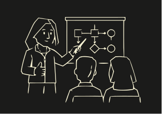
I started by finding issues myself. Eventually, I was helping others develop the eye to find them too.
A good process isn't just something you follow. At some point, it should become something other people can use without you.
I've been thinking about this a lot lately.
Earlier, the design process naturally built a story.
Ideas led to decisions.
Decisions came with trade-offs. Trade-offs shaped conversations.
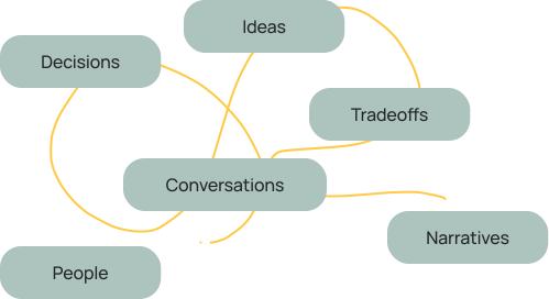
Each step carried reasoning forward.

But with AI, we are often jumping straight to the outcome.
But then, when the outcome arrives faster than the reasoning…

We suddenly have to
reconstruct the story.
When visible process disappears, Articulation becomes the only proof that thinking happened.
AI is definitely good at helping us start, but…
With the advent of AI
Choosing what's right? Choosing which direction survives?
Rather than… spending time building the groundwork.
Selection Requires Judgment.
Judgment Requires Articulation.
 It's not enough for a designer to make the right decision. The room also needs to understand the thinking behind it.
What helps me?
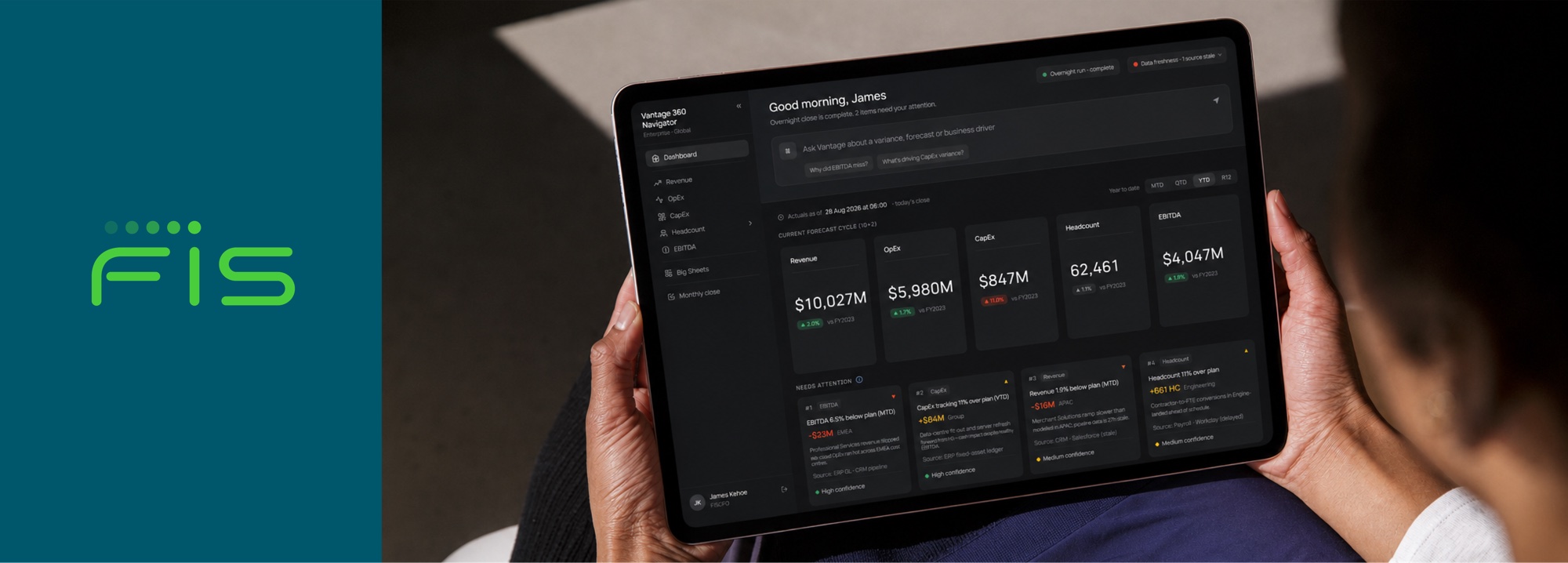
Vantage 360 Navigator
Turning fragmented financial data into confident decisions with an AI-powered FP&A navigator.
If you'd like to learn more, please get in touch.
Financial insights were spread across multiple Power BI reports.
FIS relied on Excel-based reports spread across multiple locations, with no standardized format and no role-based access. The FP&A team spent significant time locating the right report or KPI, and heavy dependence on them for report access kept self-service adoption low.
The initial approach was to consolidate reporting within Power BI, but its usability constraints made it inadequate for the experience the project required. The team moved to a purpose-built web application instead: the FIS 360 Navigator. It serves as a single access point for all FP&A reporting, with persona-driven visibility so each user sees only the reports and metrics relevant to their role.
The platform now hosts 20+ reports across 10+ personas, covering Banking and Capital Markets.
I was one of two designers on this project, and over time took responsibility for translating business requirements into design decisions and coordinating directly with stakeholders. FIS was among the first external clients for which this Accenture-developed model was deployed at scale.
FIS had no centralized reporting structure. Reports were spread across multiple locations, built in inconsistent formats, with no role-based access. The FP&A team manually fielded requests and directed users to the right data, making self-service nearly impossible.
One platform. Four perspectives.
Vantage 360 was designed around the people responsible for financial performance.




How might we unify fragmented reporting without losing role-specific context?
The existing Power BI reports became the starting point. Each report had a different layout, and studying them revealed that information hierarchy was the most significant usability problem, a direct consequence of Power BI's structural limitations, where layout control is constrained by the tool itself.
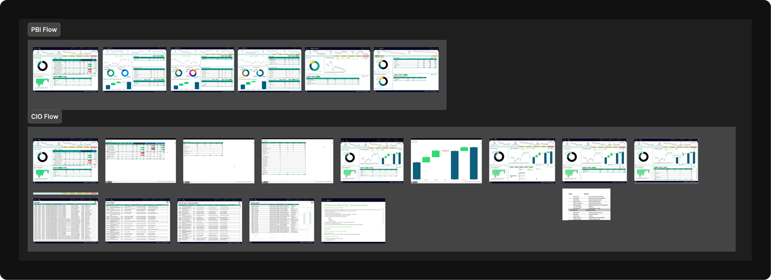
From there, we moved into sketching structure and IA. The priority was defining a clearer starting point for each role while preserving access to the depth of financial data users already relied on.
Moving to a web application was what made this possible. It gave the team layout flexibility that Power BI could not offer, and the structure that emerged reflected that: personas at the top level controlling what each user sees, with report navigation on the left giving access to the right information without additional mediation.
We shifted the experience from searching to surfacing.
We asked how AI could bring the right information forward.
Each report has an AI investigation layer embedded within it. A user can type a question in natural language, such as "Why did EBITDA miss?", and the system runs a set of context-aware agents: anomaly detection, variance analysis, data freshness checks, and commentary. The output is a structured, cited response with suggested follow-up questions at the bottom.
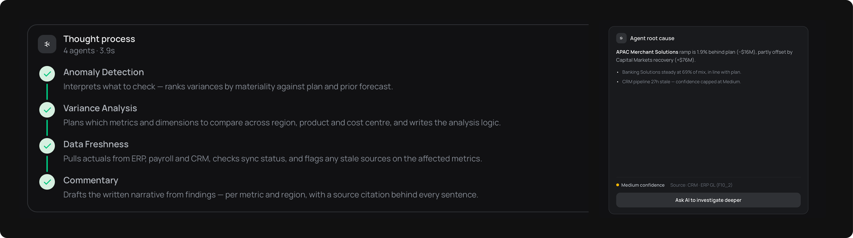
The design challenge was integrating this without disrupting the report experience. The layer opens as an overlay, keeping the underlying data visible, so the investigation feels connected to the report rather than a separate tool.
A walkthrough of the product, from launch, into the morning dashboard, and down into a persona's drill-down.
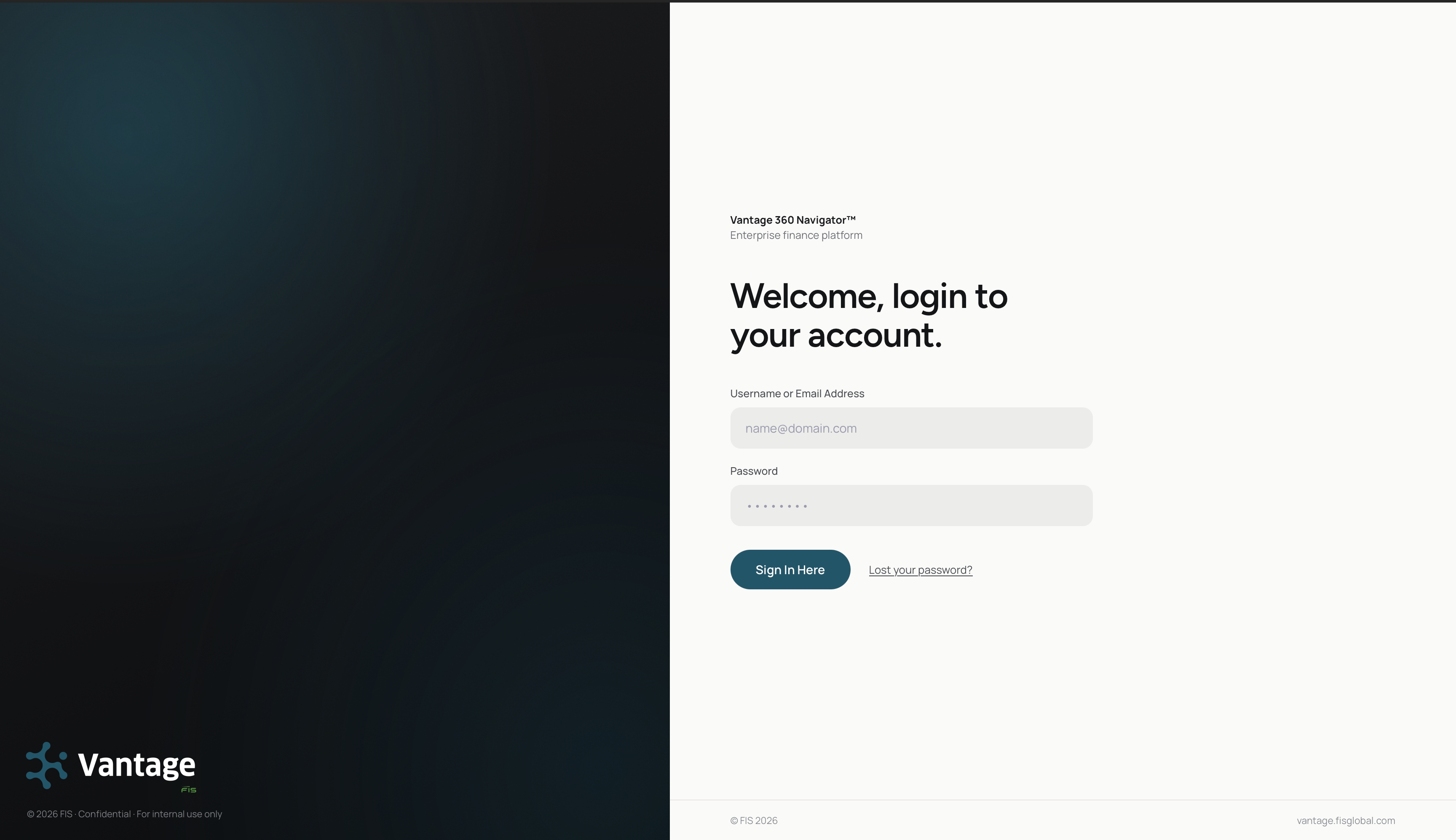
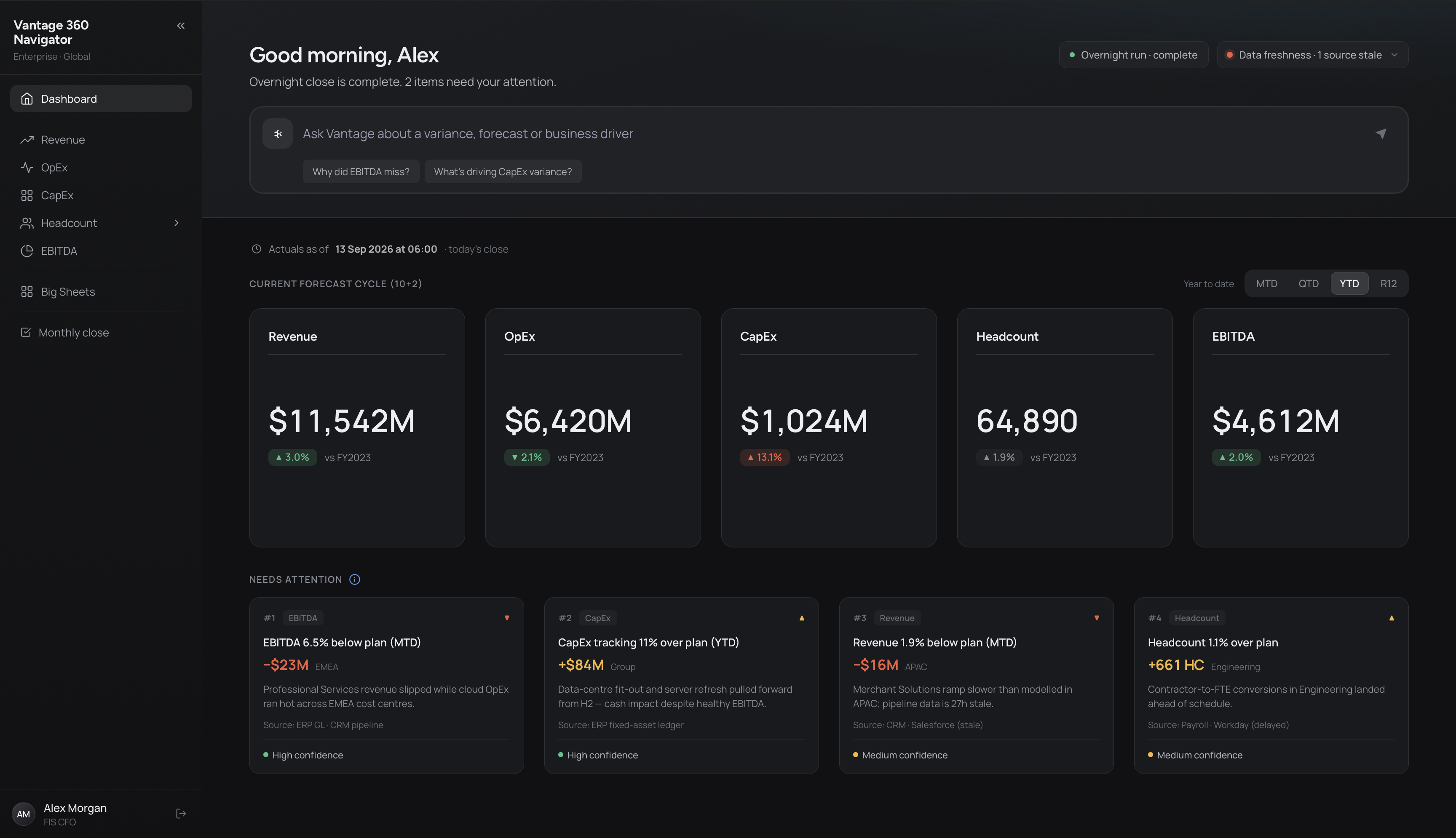
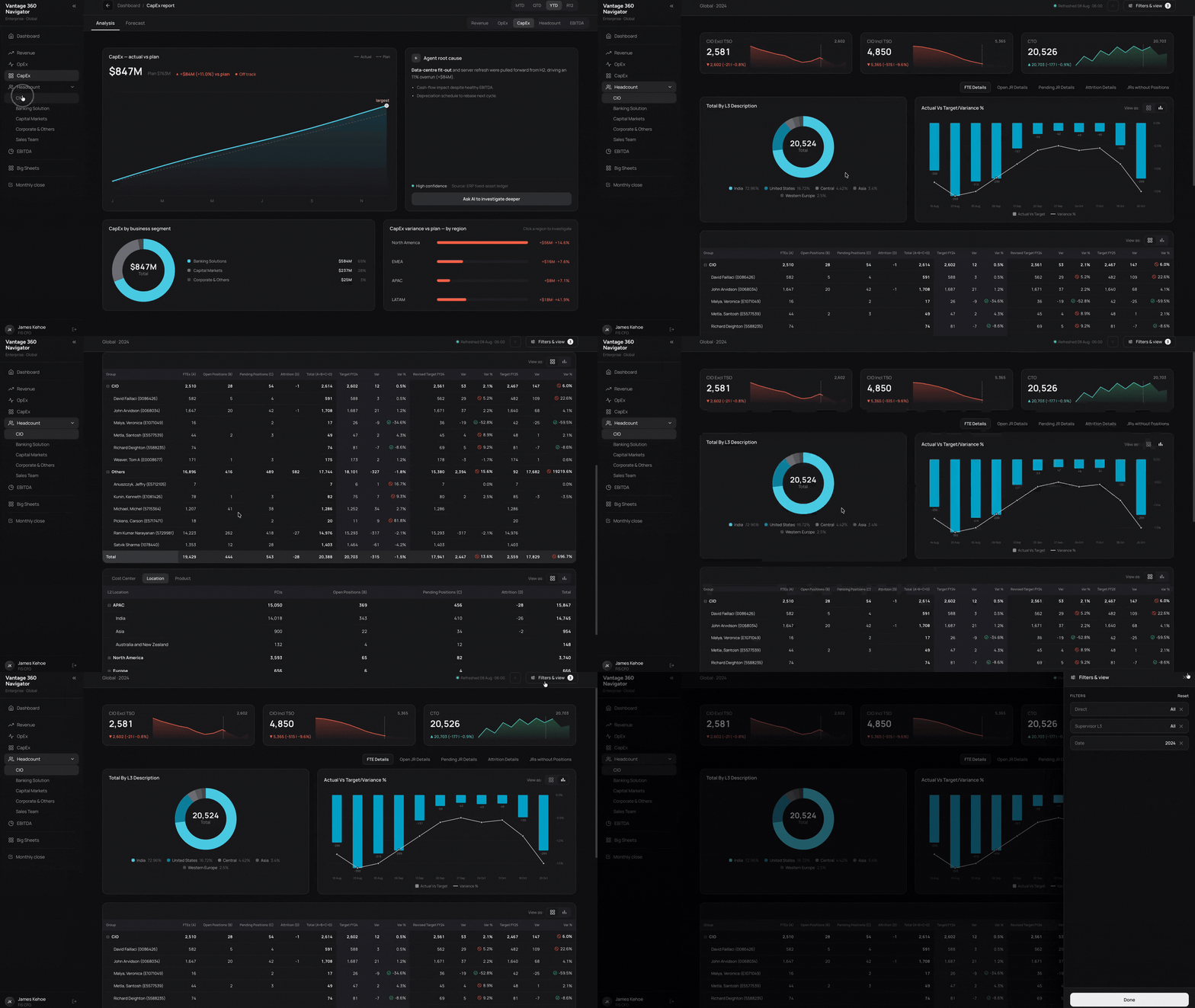
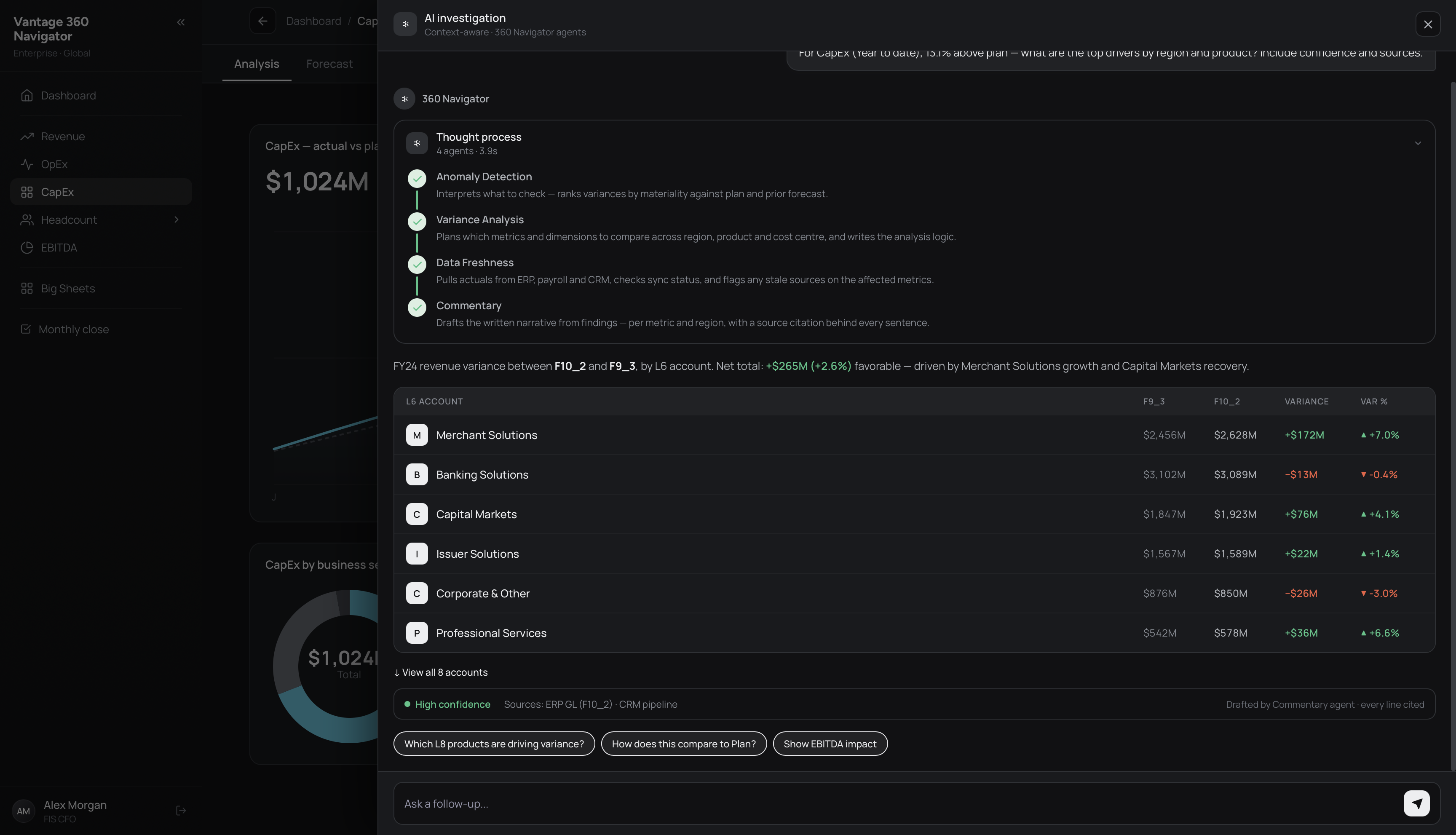
The Navigator consolidated fragmented reporting into a single, persona-aware hub.
Report discovery became faster, FP&A team dependency dropped, and self-service reporting became viable for the first time. Automated data pipelines replaced manual Excel processes, making data quality more reliable.
The platform now serves 20+ reports across 10+ personas, one of the first external deployments of this Accenture-developed model at scale.
Senior Manager · Accenture OperationsTransformation Leadership · Accenture OperationsThe Navigator model was already being extended to other teams by the time the engagement progressed. BRG and the Controller Cockpit were the next areas in scope, each hosting a different category of reports, Reconciliation Analysis, Journal Analysis, and Payables Optimizer among them.
The same persona-driven structure applied, with the platform expanding to cover a broader set of functions across the organization.
Beyond FIS, the product was demoed as an MVP to prospective clients and directly contributed to winning new business for Accenture.
Auskey Mobile App
Building the first companion app for a Bluetooth digital stethoscope, from feature scoping to shipped product.
If you'd like to learn more, please get in touch.
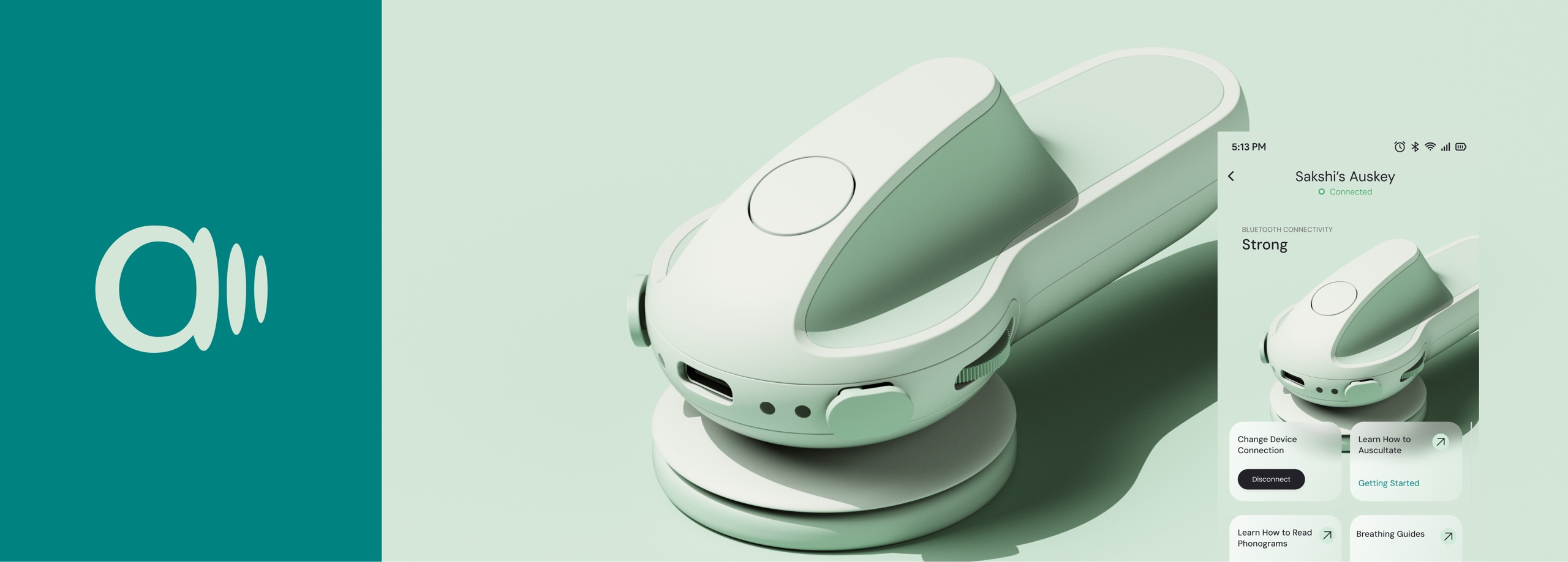
Auskey is a Bluetooth digital stethoscope for clinicians.
Heart and lung sounds stream from the device to an iPhone, saved against a patient record and available for playback and sharing. The companion app did not exist before 2024.
I joined as Product Designer in a four-person design team, across two months of involvement. The product is now live on the App Store in India. The first decision was strategic: MLP or MVP. Clinicians work in high-stress environments where reliability beats delight, so we chose MVP. Ship, learn, iterate.
We benchmarked competing apps, scoped 12 feature groups, wrote PRDs and user stories, and handed wireframes directly to development. Nothing was inherited. Everything was defined from scratch.
Defining the product was the design work.
The client knew what Auskey could become. What they did not have was a path to get there. No brief arrived with the project, no PRD, no feature list. A working hardware product existed, alongside a set of long-term objectives describing an ambitious future for clinical auscultation in India.
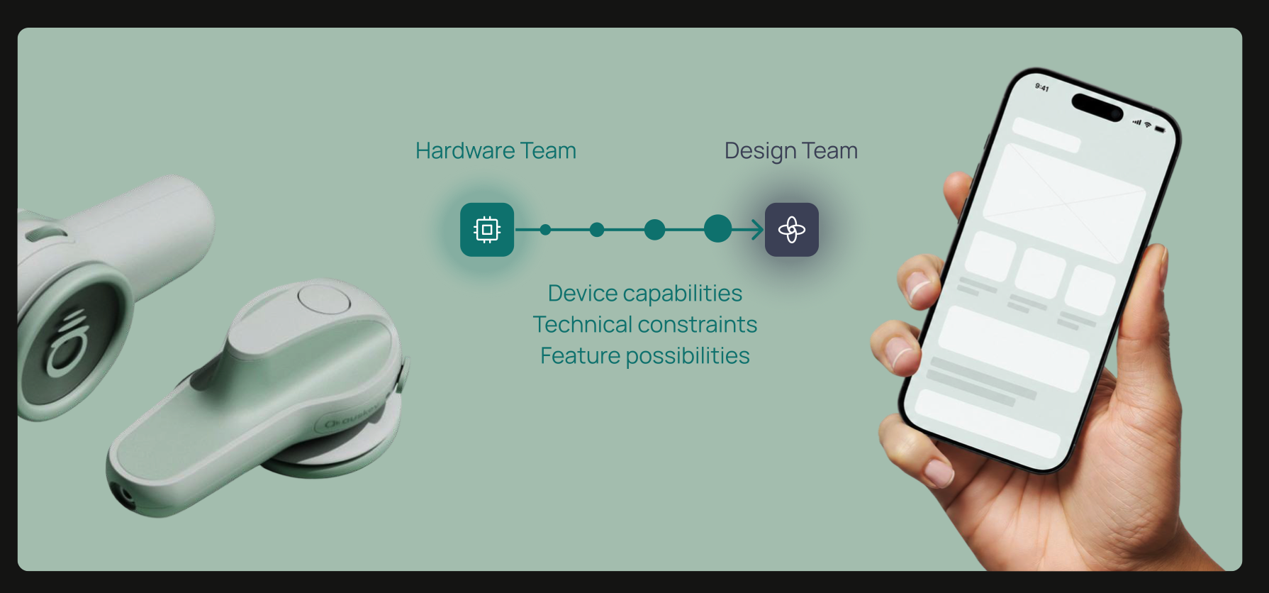
Getting to a feature scope meant working closely with product, development, and industrial design teams to understand what the app could realistically do. Benchmarking competing clinical apps ran in parallel, surfacing what the market had already built and where Auskey could position itself.
One question came out of that research: what needs to ship first? That led to a structured evaluation of two product approaches, and a decision that set the direction for everything that followed.
Two approaches emerged: MVP vs MLP.
Building a Minimum Lovable Product meant investing in emotional depth from day one: a richer, more considered experience that could build early loyalty.
Building a Minimum Viable Product meant shipping the core clinical workflow, learning from real usage, and iterating from there.
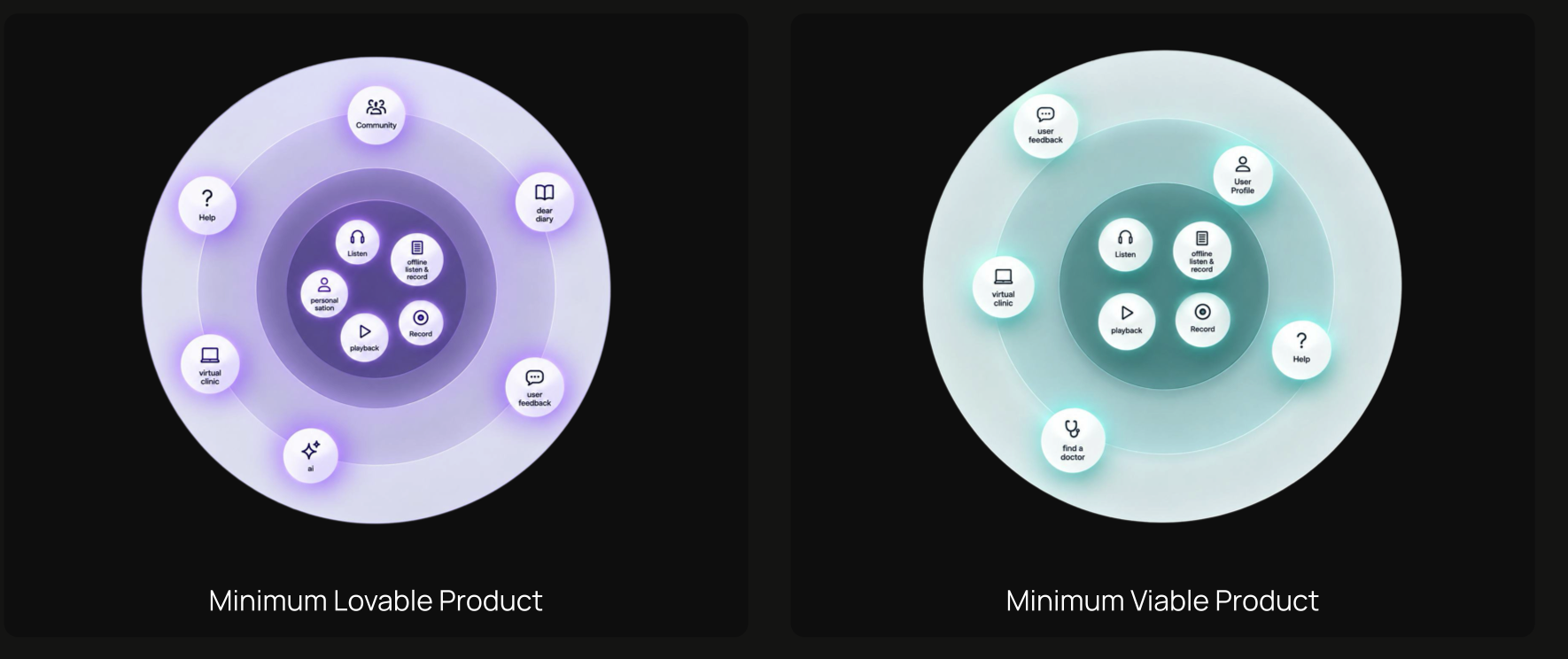
For a product used in high-stress clinical environments, where a clinician is mid-exam and needs the app to simply work, functional reliability had to come before delight. We chose MVP.
Understanding the market shaped what we built.
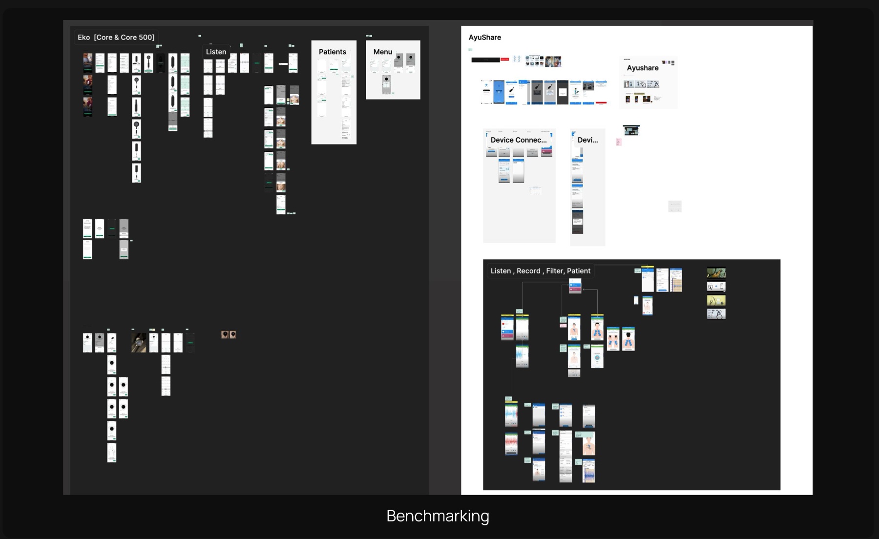
The process began with competitive benchmarking across Eko and Ayusynk, structured across nine feature categories. That research directly informed the feature scope. The team collaborated on PRDs across 12 feature groups, each with user stories from the clinician's perspective. Wireframes followed and went directly into development without a revision cycle.
We wrote our own PRD, and it was the best thing we did.
This was the part nobody expected. Usually a client hands you a list of features and you design them. Here, we figured out what the product needed to do, wrote the user stories ourselves, defined what "done" looked like for every feature, and then got the client to sign off on it.
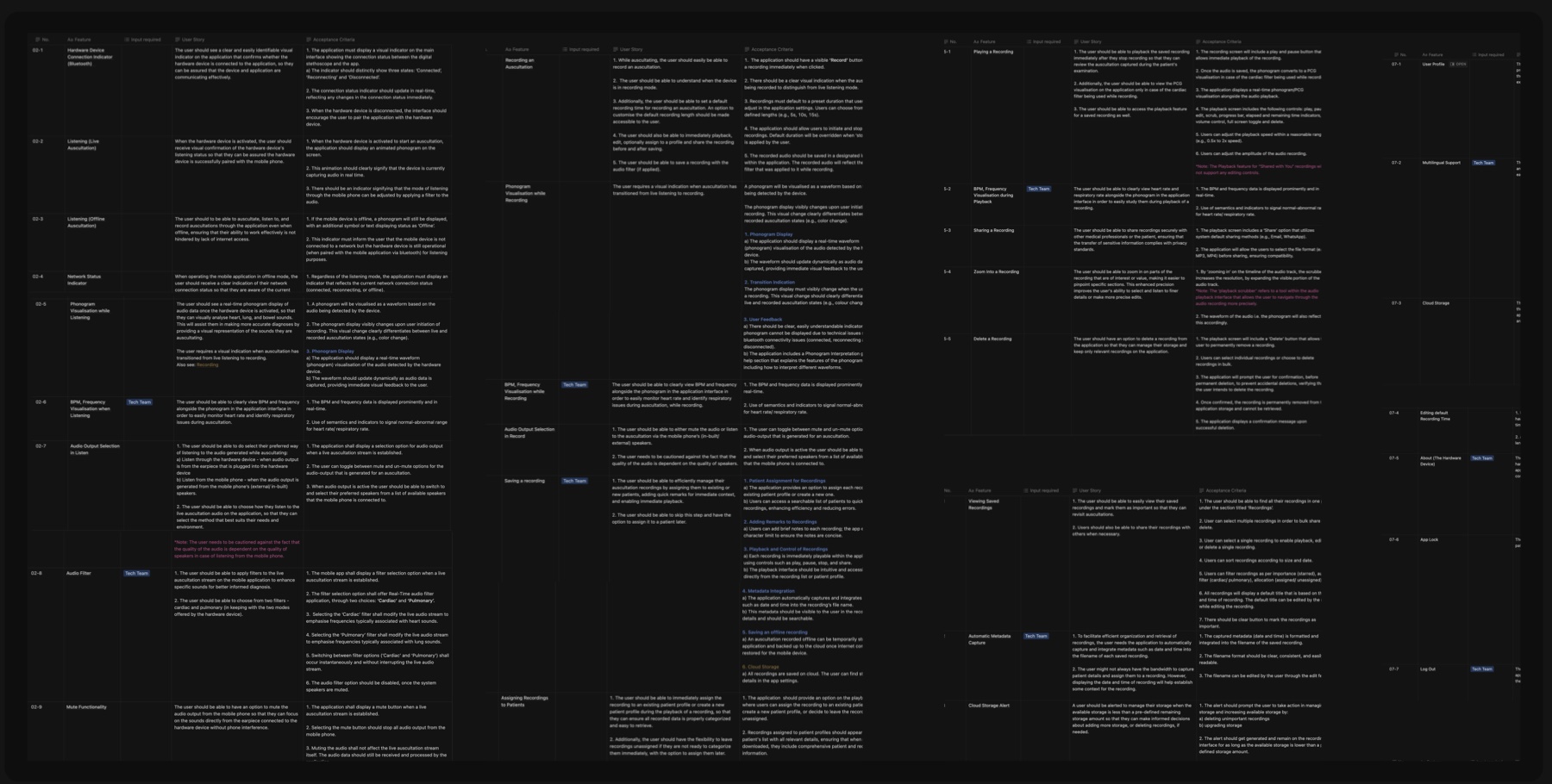
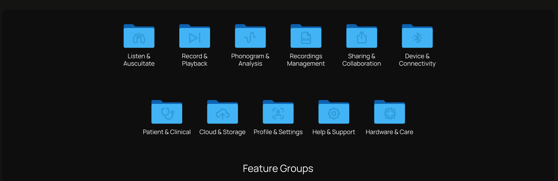
Twelve feature groups, translated into a shipping MVP.
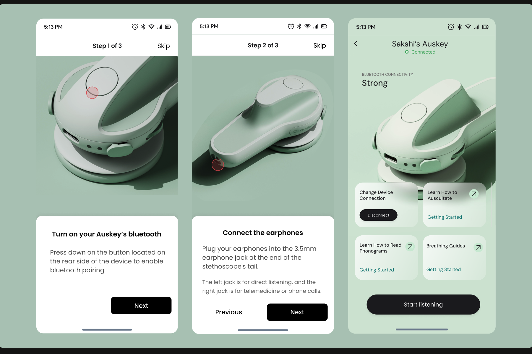
Step-by-step Bluetooth pairing with annotated device visuals, designed to help first-time users understand both how the hardware works and how to connect it to the app, landing on a confirmed connected state with quick links to get started.
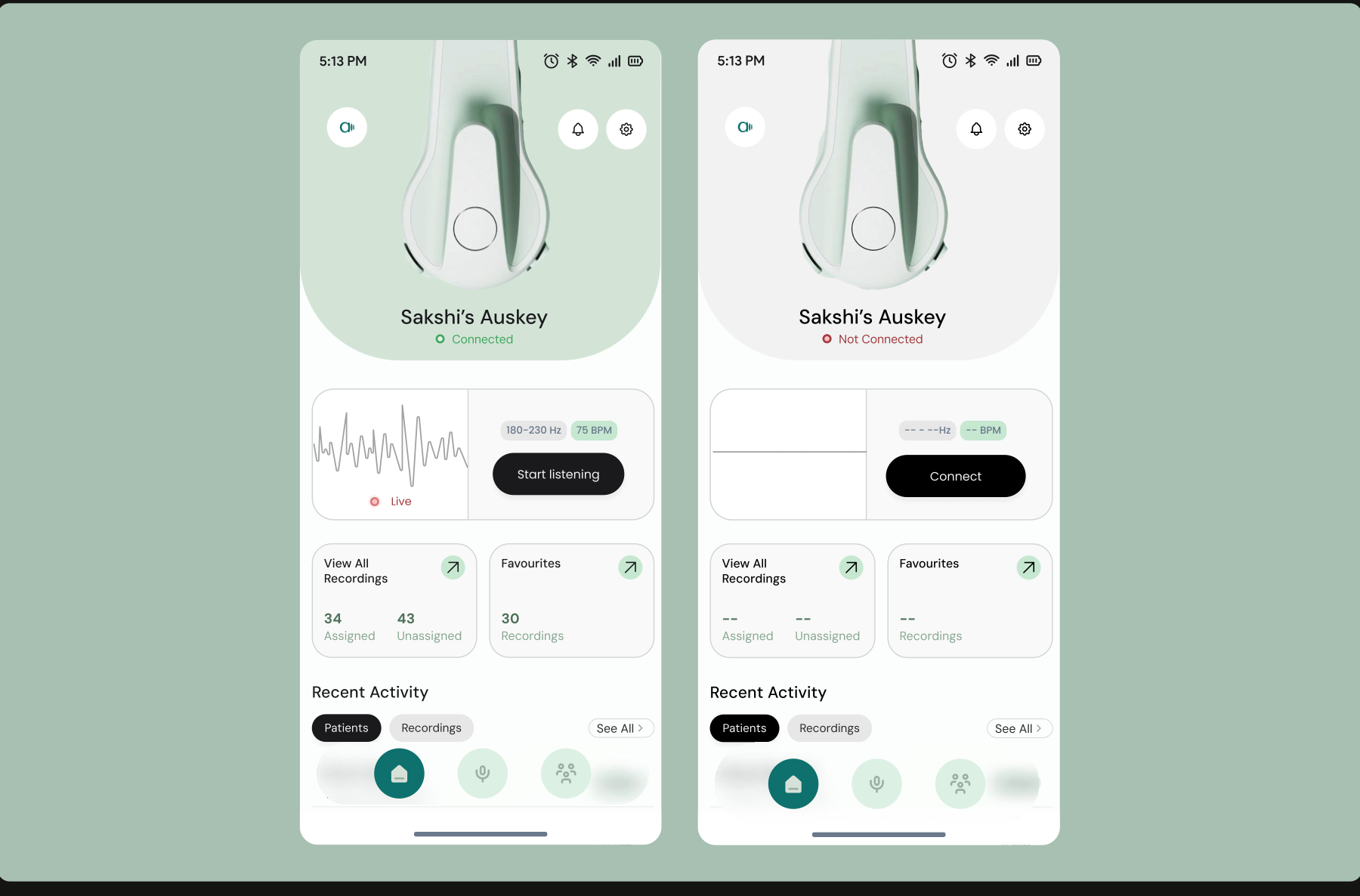
The home screen adapts to the device's connection state. When connected, it surfaces live listening data and recent patient activity. When it is not, it replaces that space with a clear prompt to reconnect rather than leaving users with blank fields and no direction, which matters in a clinical context where confusion can slow down care.
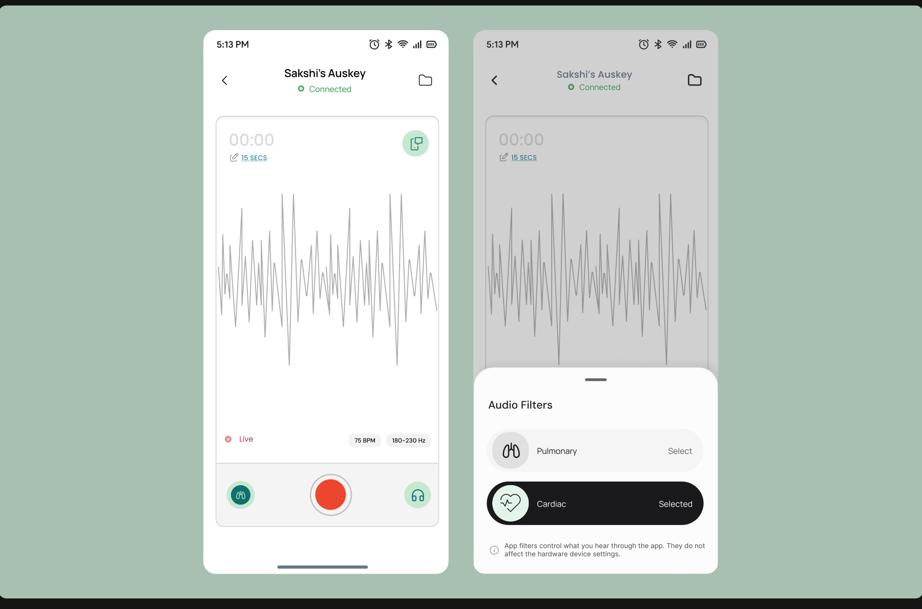
A key design decision was making the audio filter controls clearly visible during capture, so clinicians could switch between pulmonary and cardiac modes without interrupting the recording.
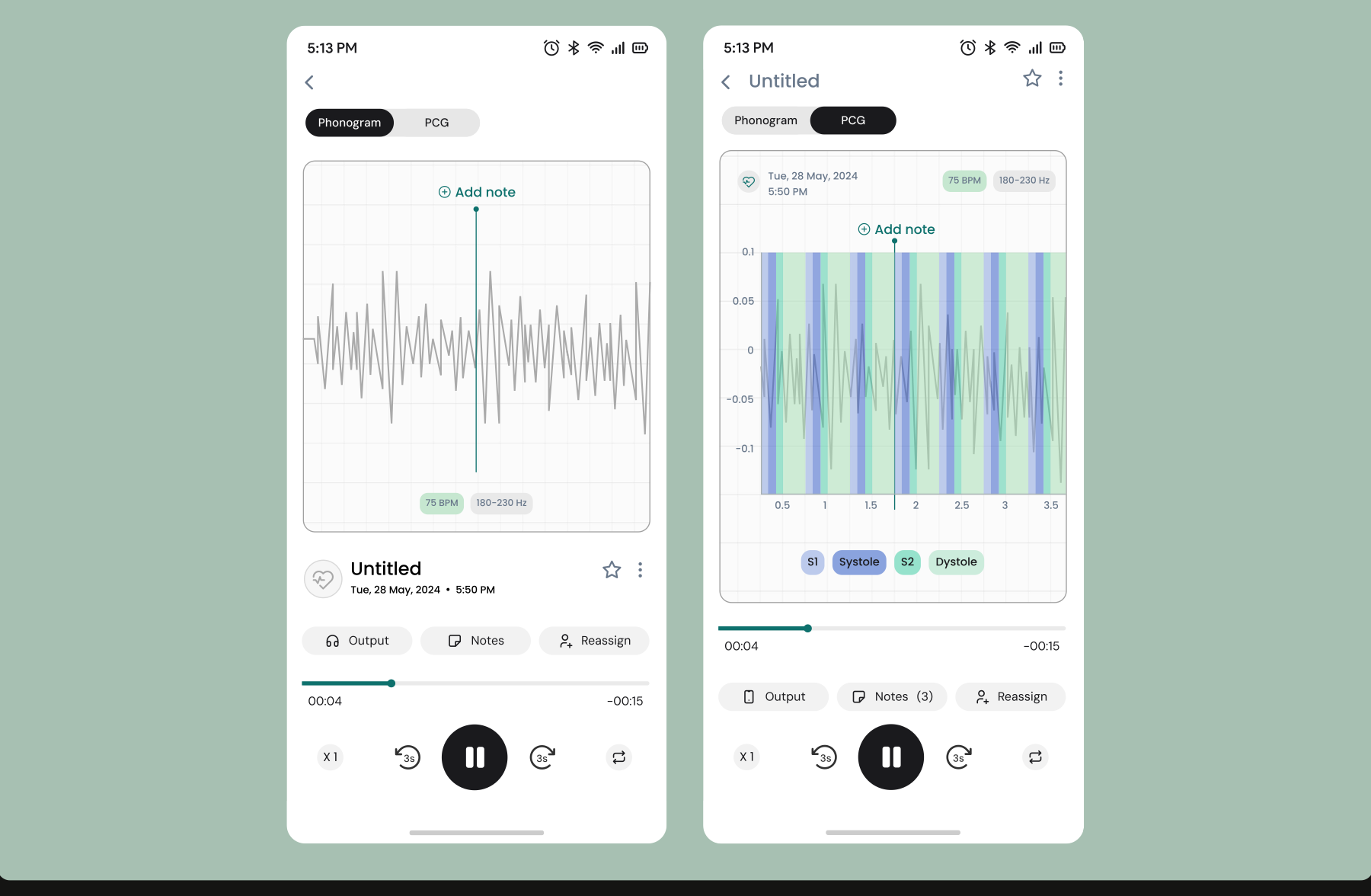
Directly referenced from music streaming interfaces, the playback screen brings familiar controls into a clinical context: scrubbing, speed adjustment, and skip, layered with annotatable phonogram and PCG views and BPM and frequency data.
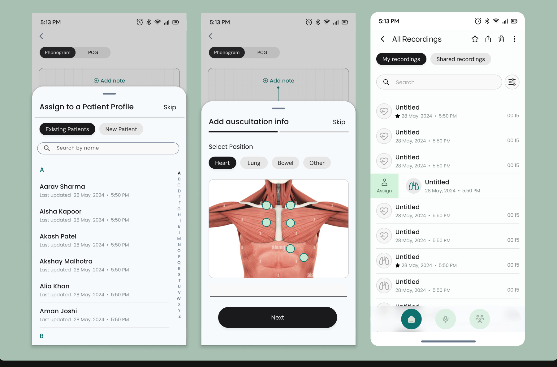
The post-recording flow uses a drawer to keep users in context, an anatomical body map for quick position logging, and a small but deliberate detail: lung and heart icons carry through into the recordings list so each entry is identifiable at a glance.
The first round of wireframes was 80% accurate.
The wireframes from the first round of design were 80% accurate, requiring only minor adjustments before moving into build. After AI capabilities were introduced, the designs were updated accordingly, with the Google Material library adopted as the design system for faster implementation.
Carma
Shipped & liveTurning climate uncertainty into financial resilience for smallholder farmers.
Design an MVP that helps financial institutions use climate data to create and manage parametric insurance for smallholder farmers.
Actuaries and data managers lacked a streamlined way to design insurance products, explore data and assess risk.
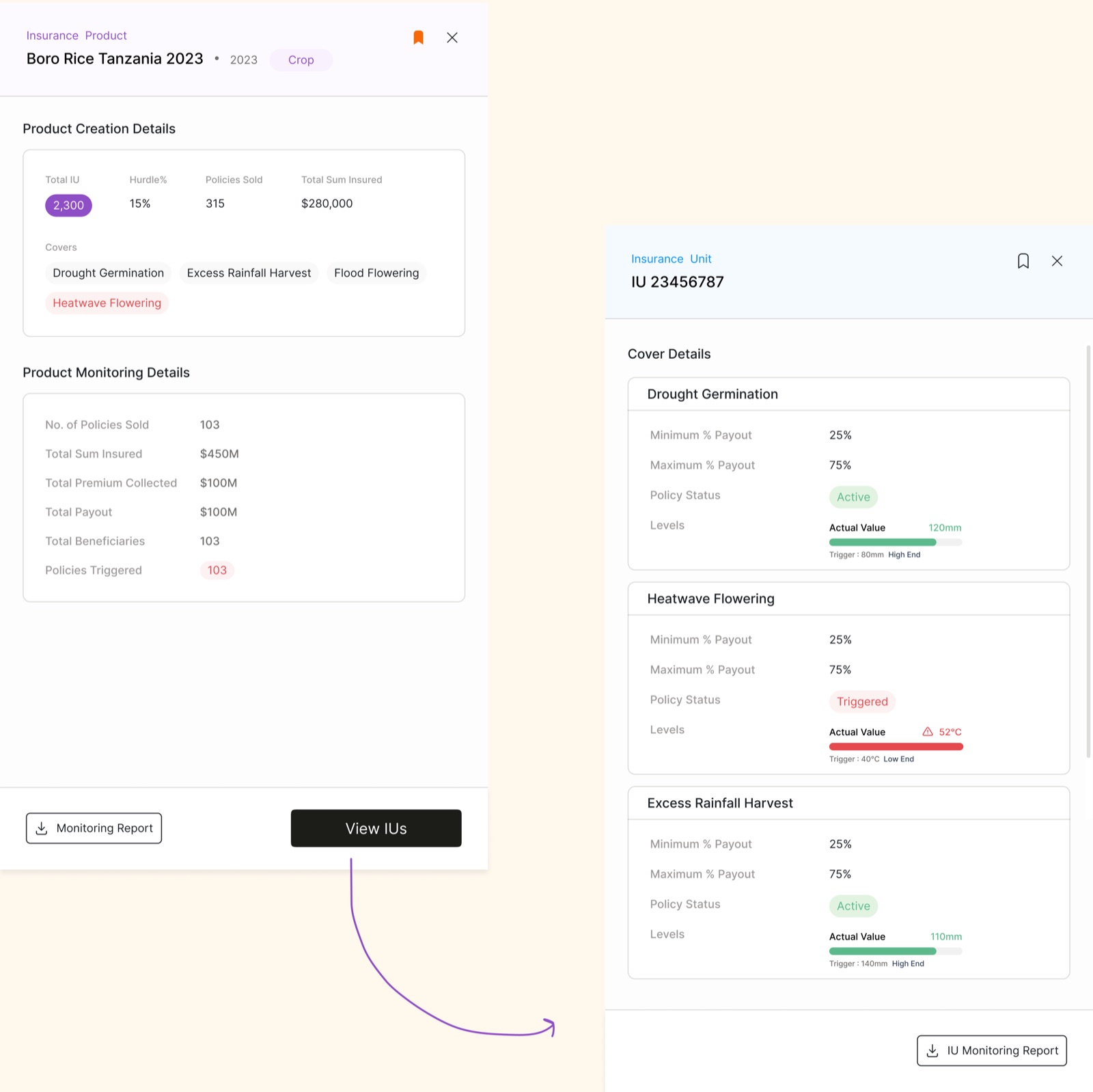
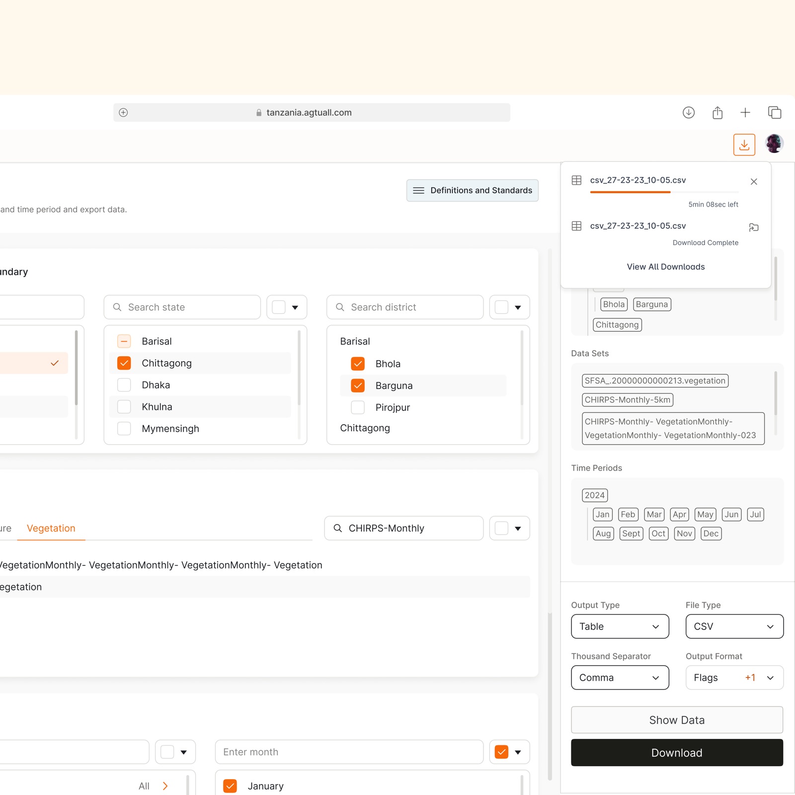
The main product walkthrough, exploring climate data, designing insurance products, and monitoring them end to end.
I initially saw this as a data-heavy SaaS problem, but research revealed that the bigger challenge was defining the product architecture and creating a clear workflow across data exploration, insurance design, monitoring and inspection. Aligning this structure took two weeks and 5–6 rounds of discussion, as both the startup and design team were shaping the product together.
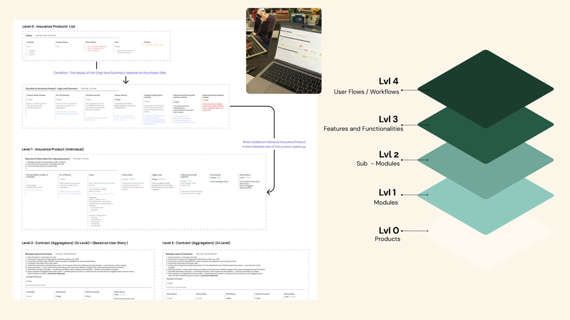
I prioritised the workflows that were most critical for the MVP, data exploration, product monitoring and inspection, while identifying capabilities like AI-powered analysis, onboarding and accessibility as future opportunities.
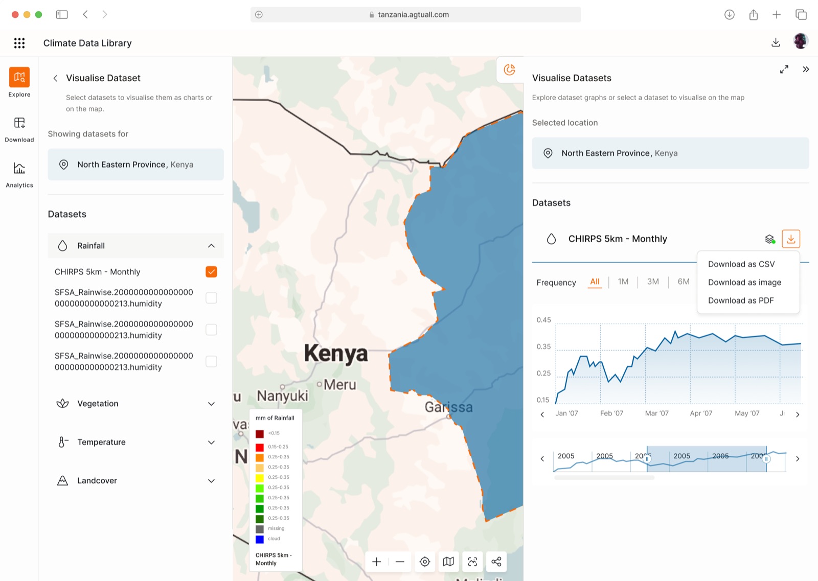
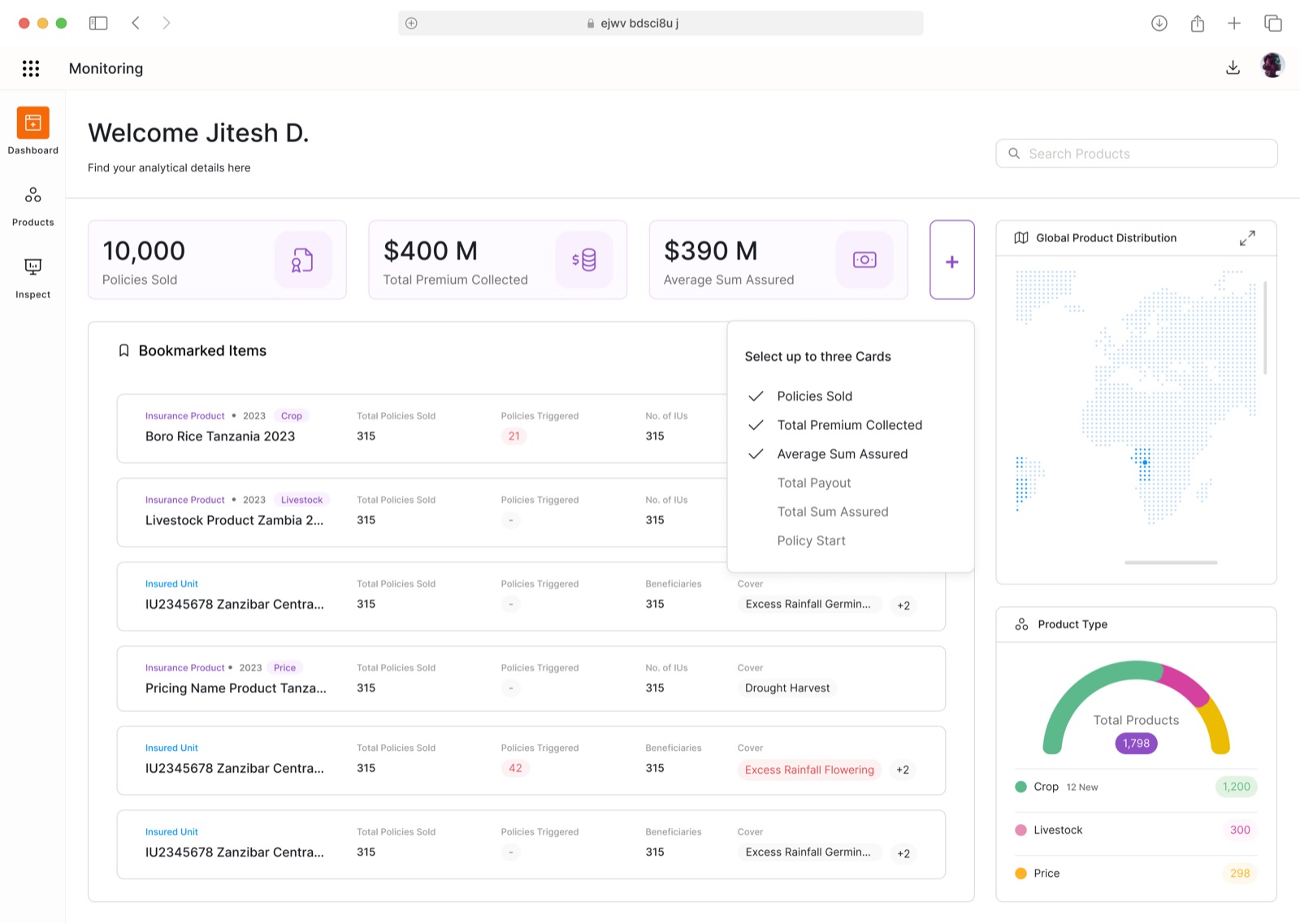
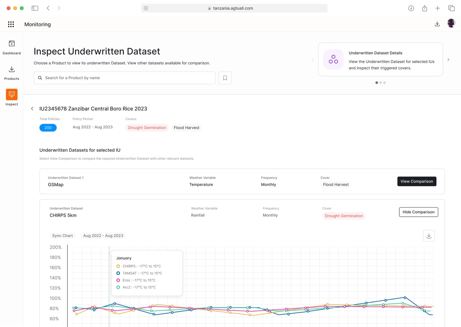
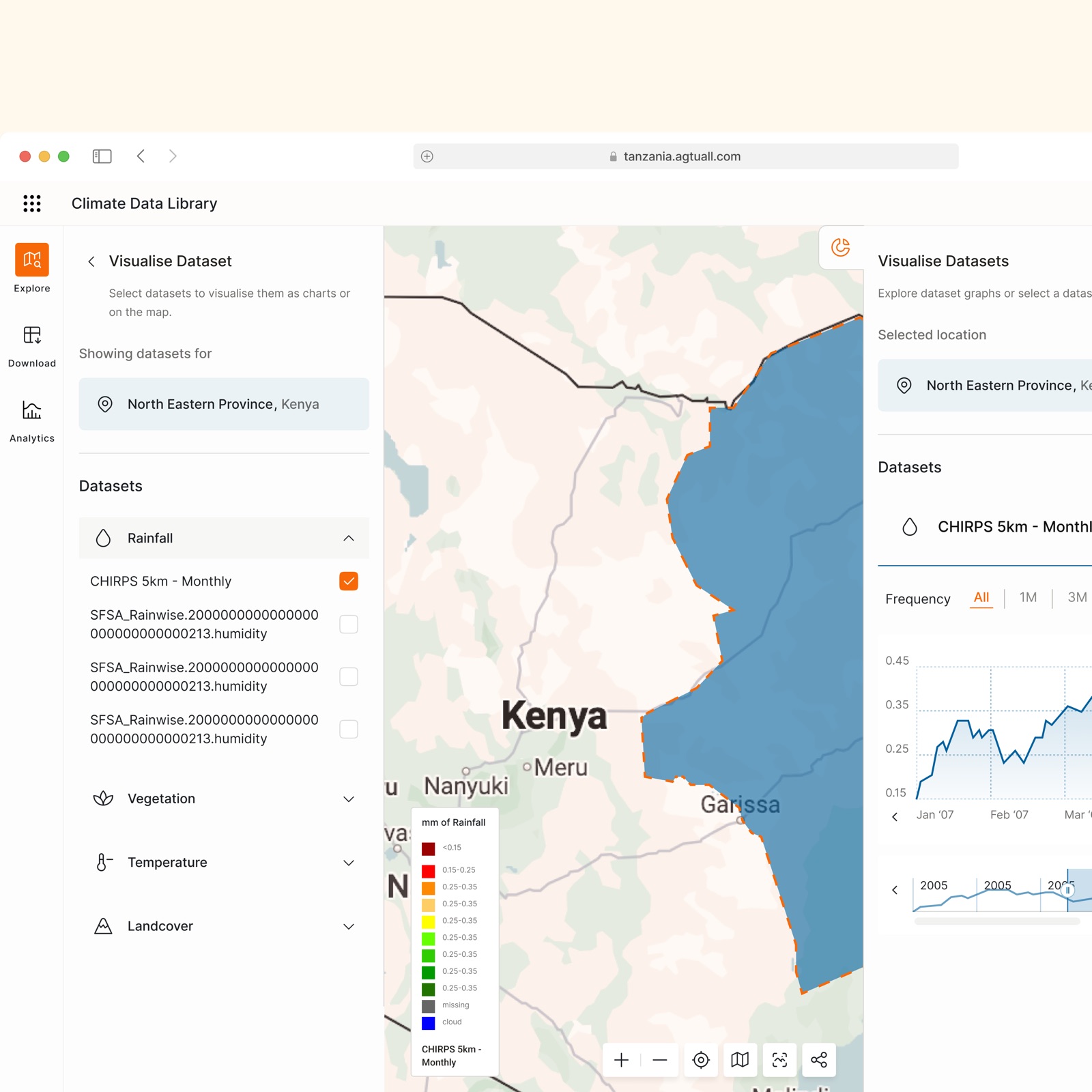
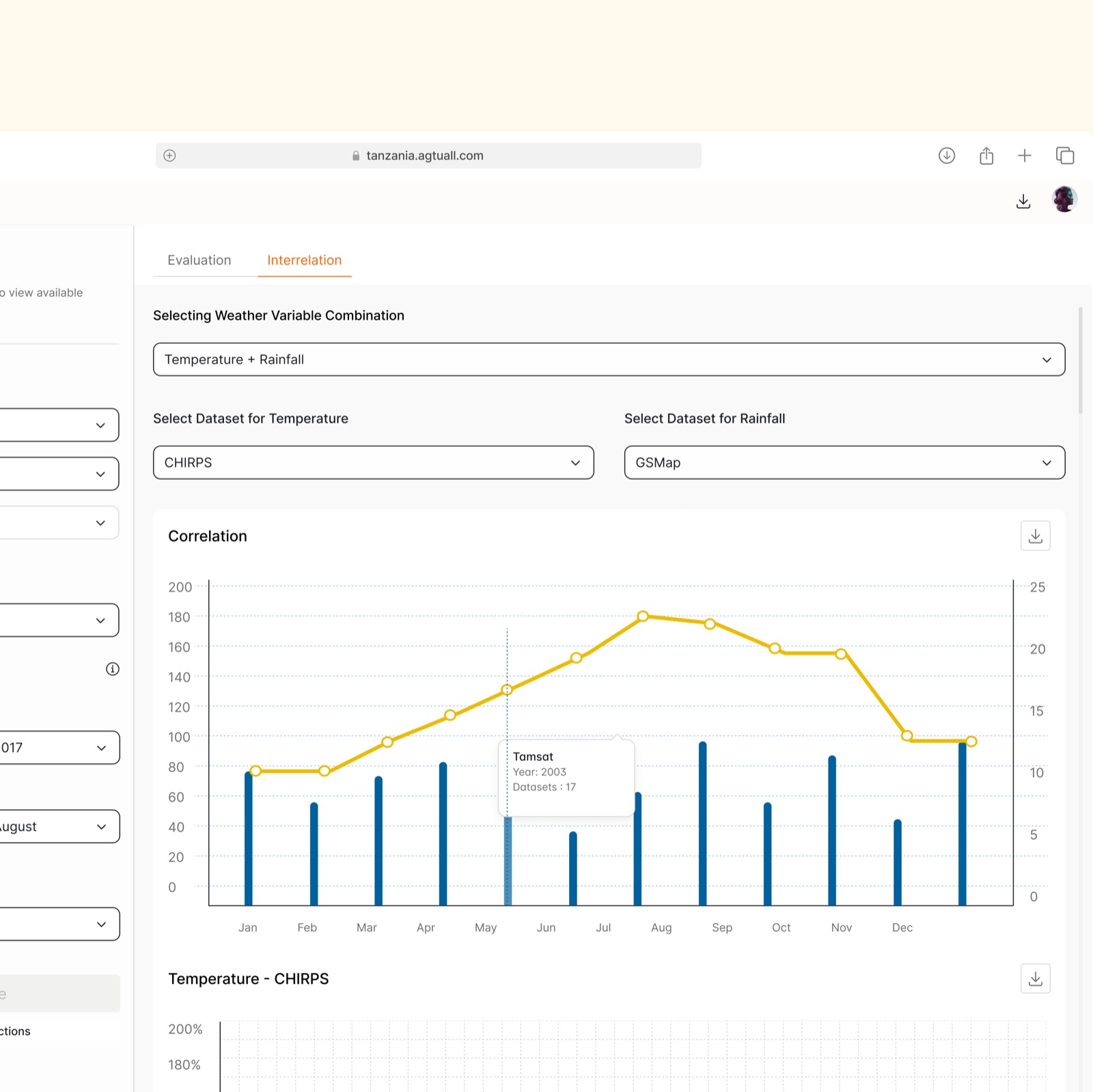
We tested the prototype with 5 participants, 2 experienced actuaries and 3 beginner users. The sessions used task-based, moderated usability testing with a think-aloud approach.
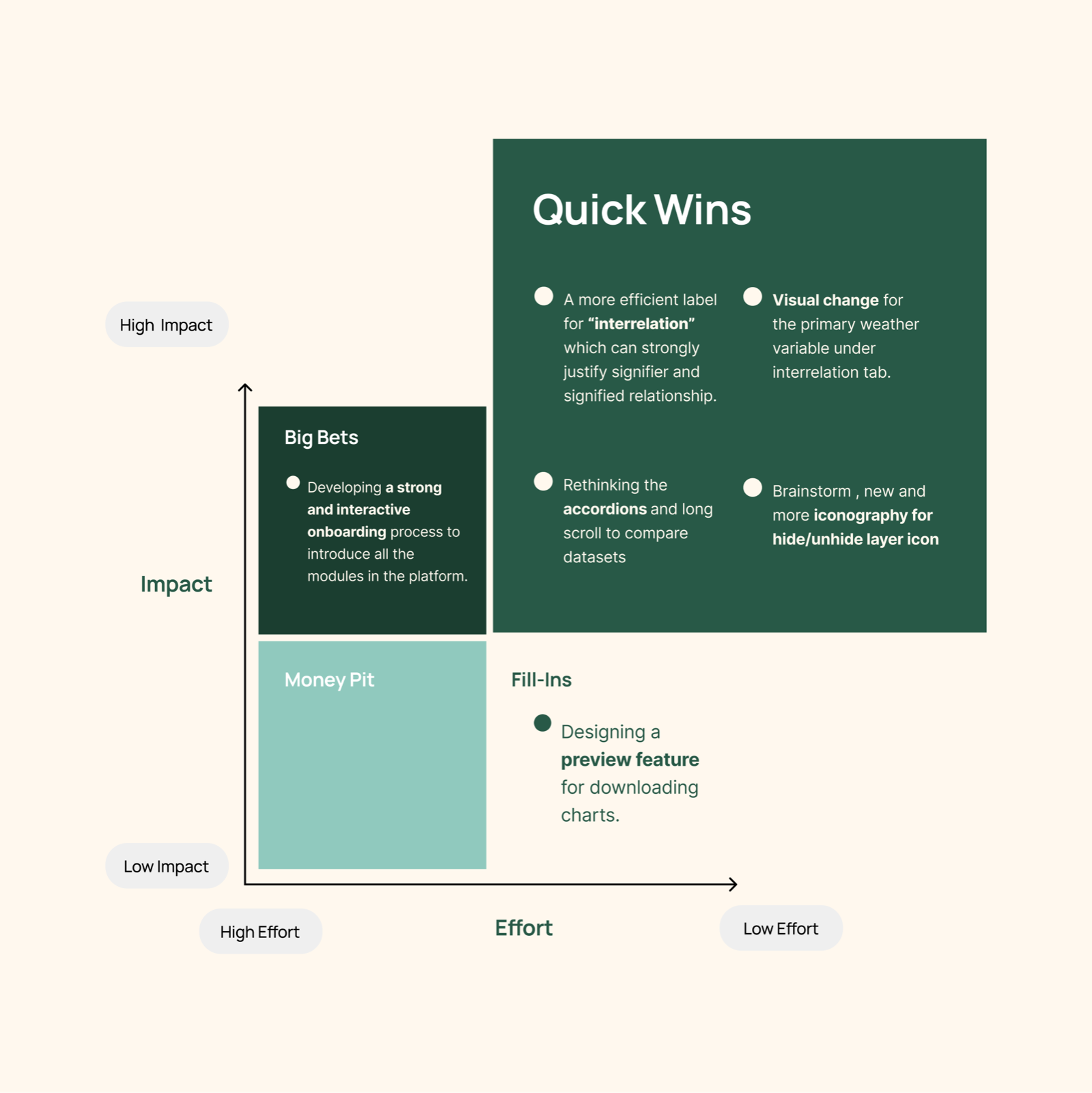
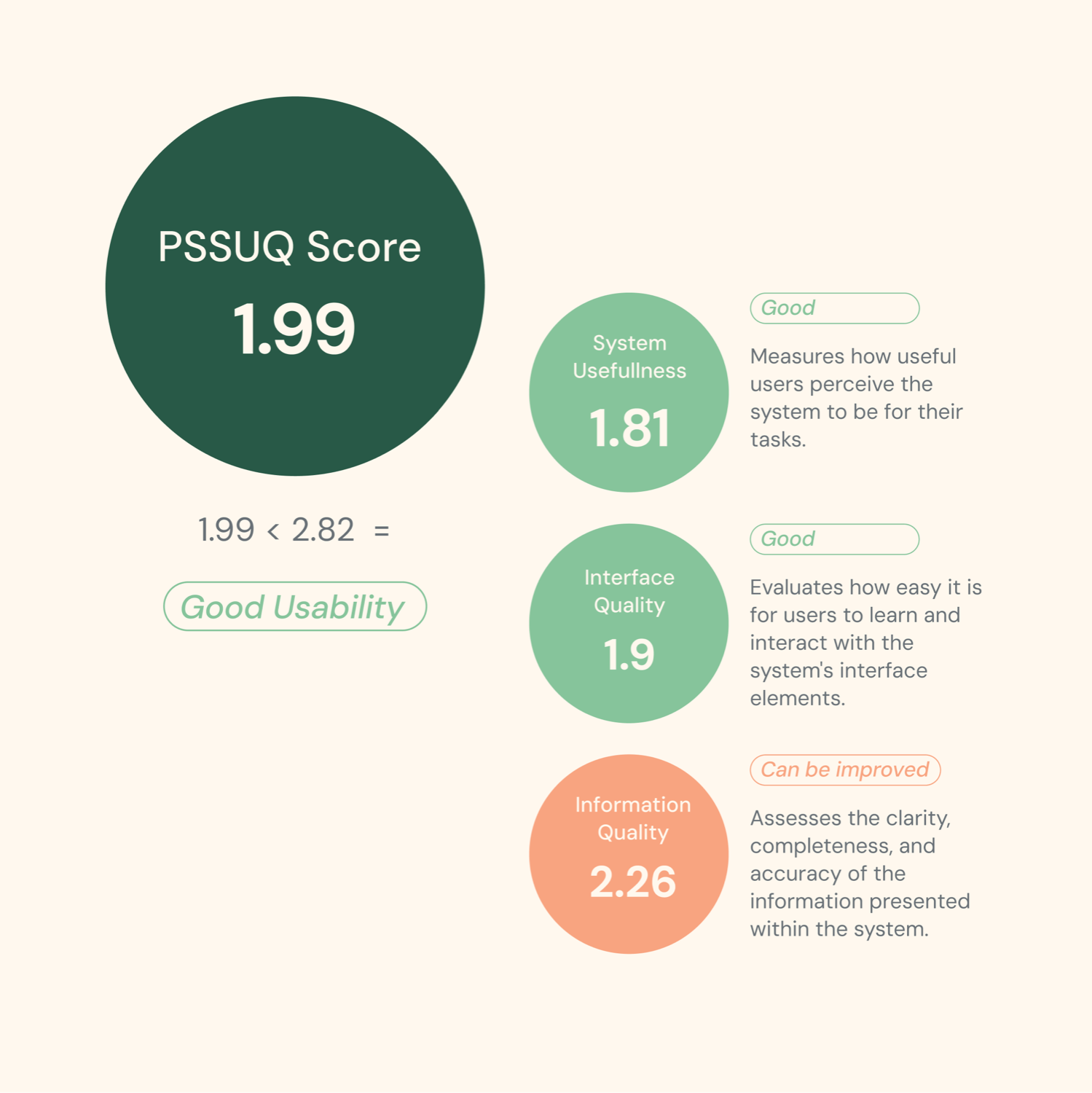
The bigger design challenge is making relationships, comparisons and system logic obvious enough that users don't have to decode how the product works.
Mallika Lahiry | Product Designer, Studio Carbon
Here's a video if you're curious about how this positively impacts smallholder farmers, let's start with some context.
Unilever App- UX Audit
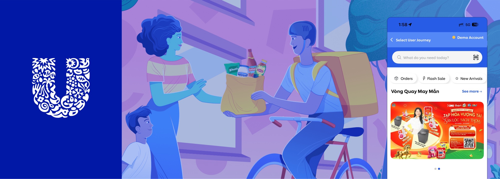
Enhancing Unilever's app to make everyday ordering simpler for retailers and sales reps in Vietnam.
If you'd like to learn more, please get in touch.
Unilever was enhancing its Vietnam retail app to create a more seamless ordering experience for retailers and sales representatives.
I analysed the existing interface across key touchpoints in the ordering journey and identified opportunities to improve usability, discovery, and ordering efficiency.
All six recommendations were accepted and implemented by the client. Because every finding traced back to competitive evidence and the audit framework's business-impact rationale, there was nothing to argue against.
The audit had to be built from the ground up, with almost nothing to start from.
This audit evaluates the ordering experience for both retailers and Sales Reps using the app.
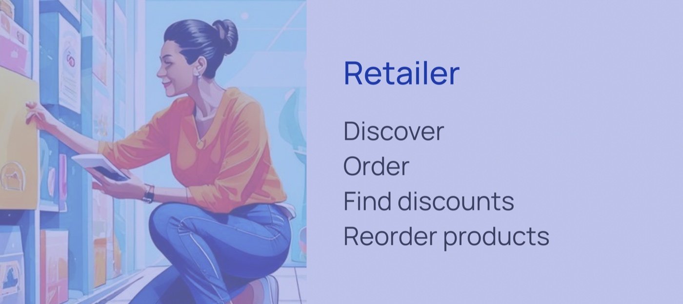
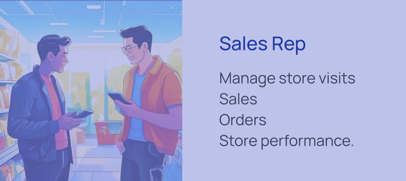
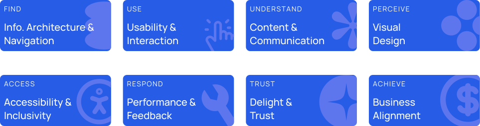




Every core screen was benchmarked, then mapped to a foundation, a problem, and a concrete recommendation. Move through the screens below.
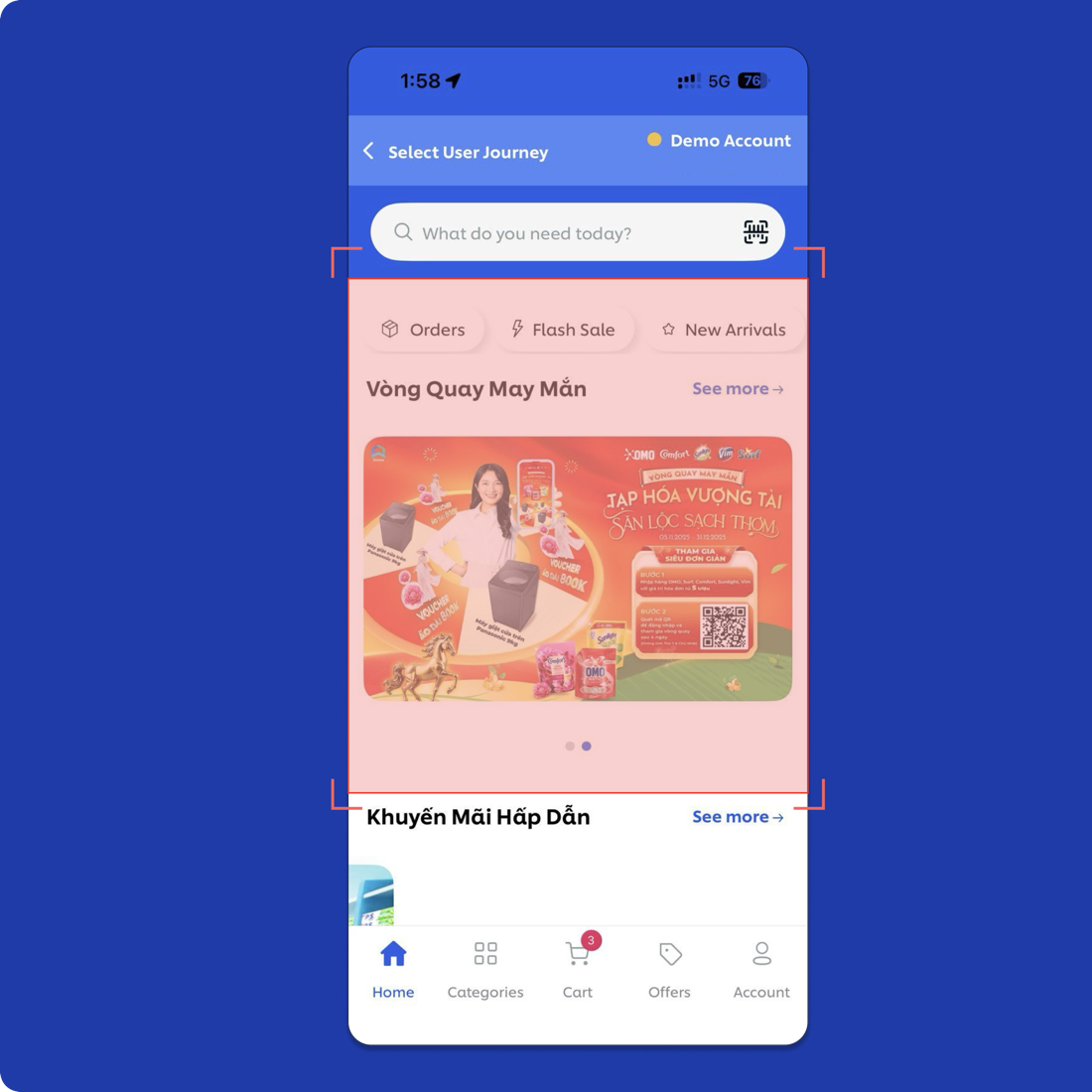
Homepage/Categories
Information Architecture & Navigation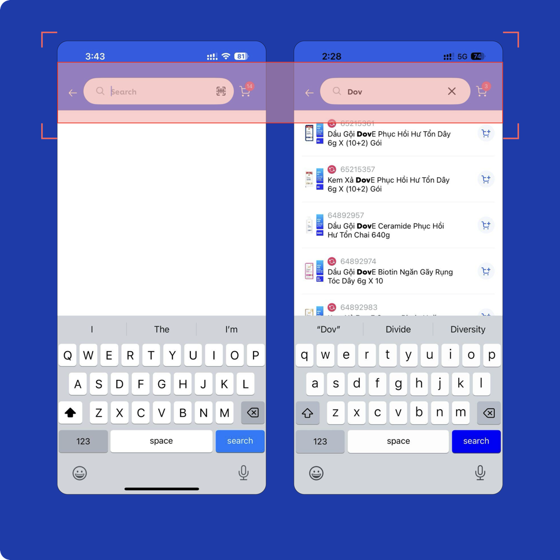
Search
Usability & Interaction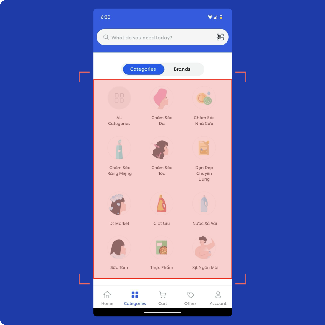
Categories
Information Architecture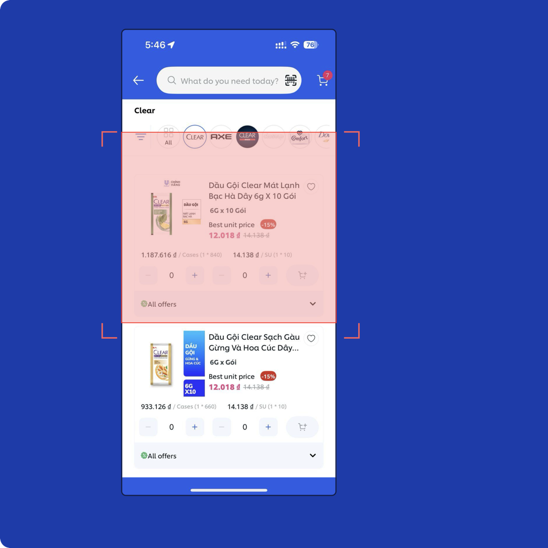
Product listing page
Usability & Interaction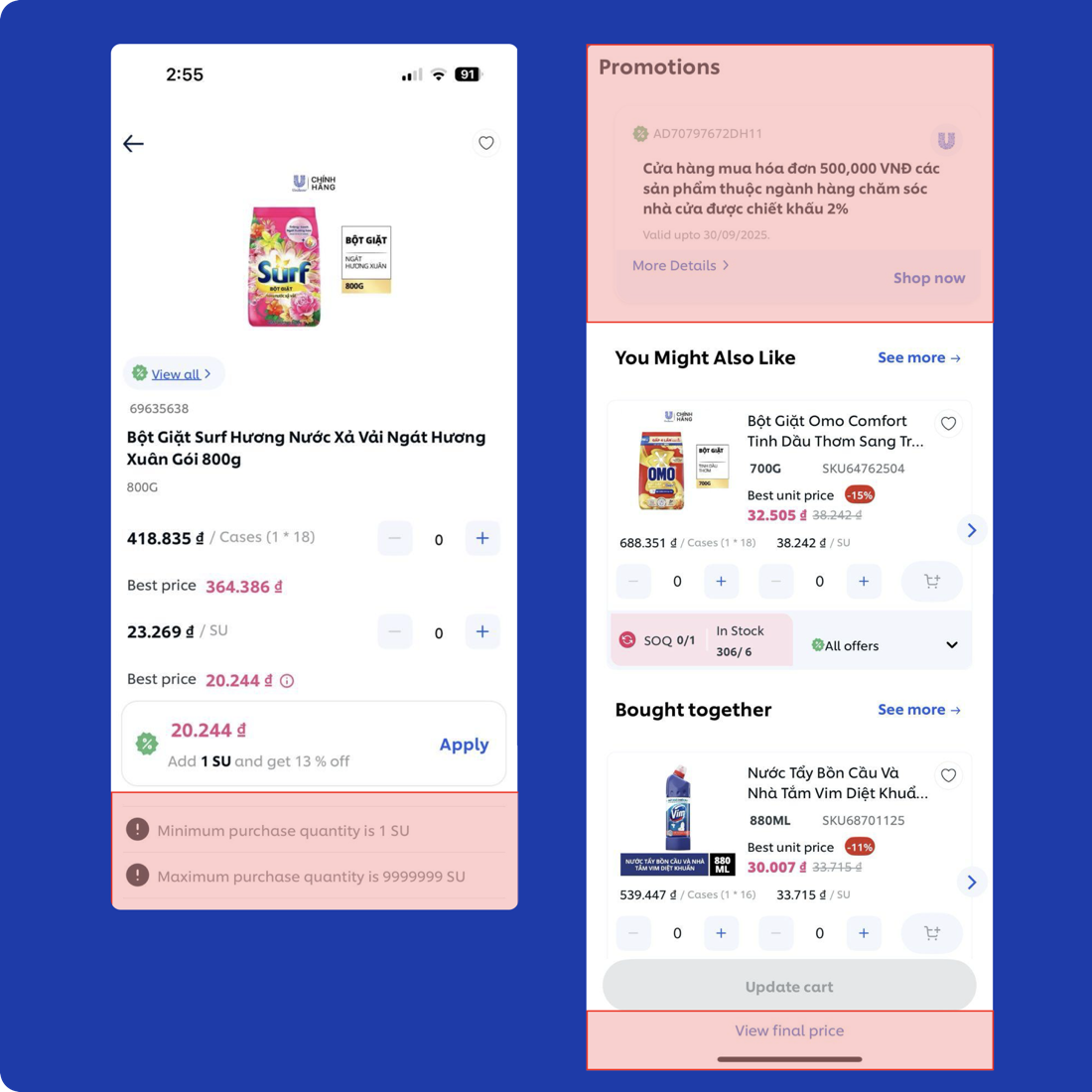
Product description page
Information ArchitectureNever be subjective.
Ground every UX observation in evidence, a clear rationale, and the user's task.
Good recommendations connect user needs to business goals, making design decisions easier to prioritise and act on.
Project Team Member